Transforming the Borrower Experience for Cardinal Financial

Rebuilding a fragmented mortgage ecosystem into one connected borrower journey.
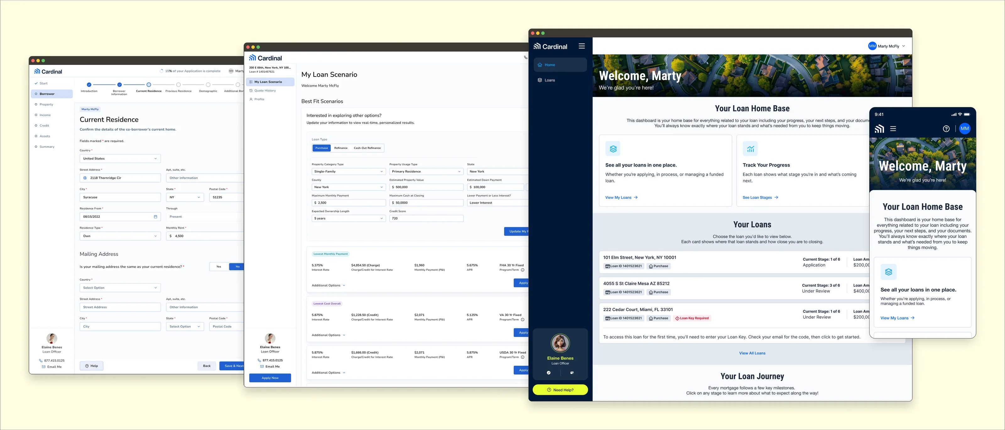
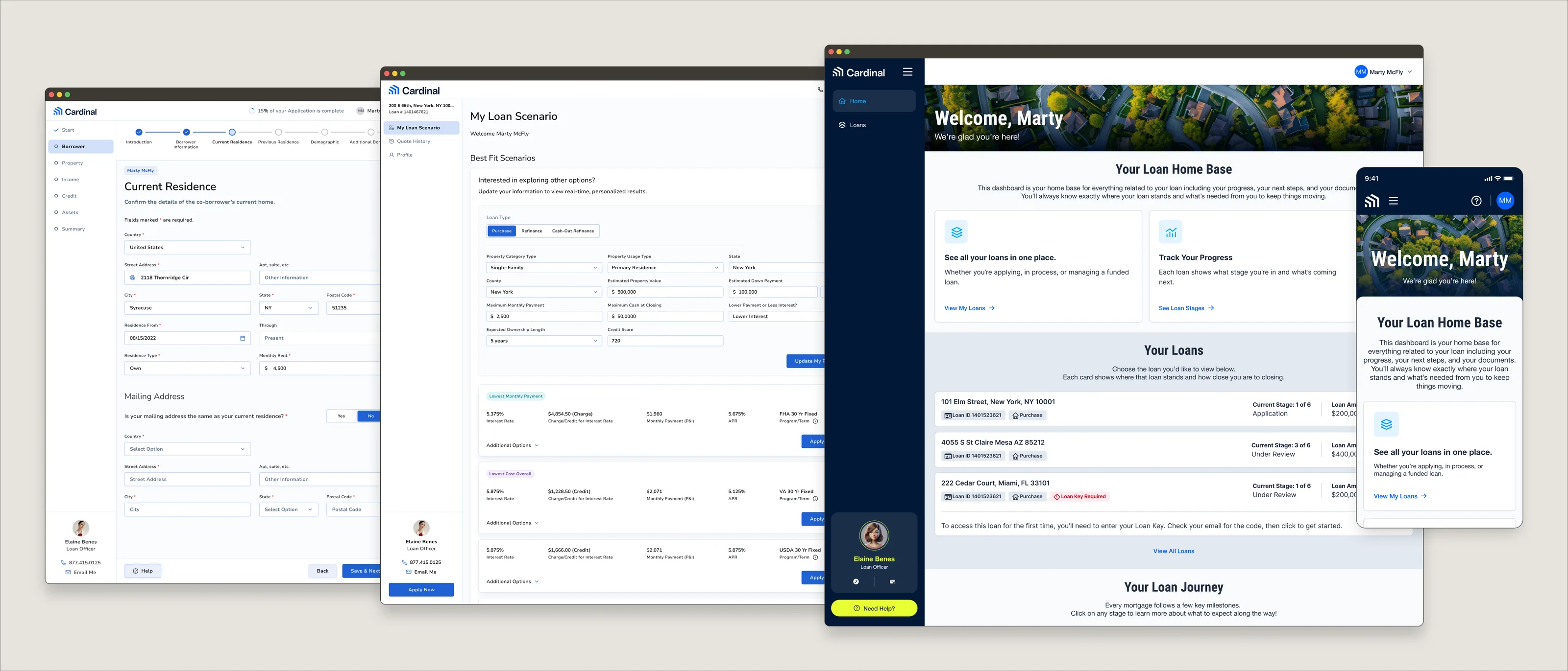
Four screens from the rebuilt Borrower Experience, overlapping in a row: the Smart App application form on Current Residence, the Public Loan Quote results listing best-fit loan scenarios, the Borrower Dashboard welcoming a borrower to their loan home base, and the same dashboard on a phone.

Details

Service
Product Design / User Experience Design
Sector
B2C Fintech / Mortgage Technology
Year
2024–Present
Role
Product Designer
Focus
Product strategy, UX research, Information architecture, Design QA

Project Overview

Cardinal Financial’s legacy B2C borrower experience and ecosystem (the Borrower Experience) had become fragmented over time. Discrete Cardinal products such as Public Loan Quote (PLQ), the Borrower Dashboard, and Smart App had evolved independently, resulting in inconsistent workflows, disconnected handoffs, and an experience that was difficult for borrowers to navigate. In addition, having grown incrementally over time to accommodate the expansion of the company’s offerings and growing complexity of the mortgage industry, the products had become overly complicated and dense.

This initiative began in 2024 as a long-term, multi-pronged, company-wide undertaking where each discrete product would undergo a transformative update, if not a total rebuild. The various project teams continue to collaborate constantly with the shared goal of transforming the Borrower Experience into a connected ecosystem that helps borrowers navigate complicated financial transactions through intuitive product flows and digestible information layouts.

Impact

The cross-functional, collaborative effort to reshape the Borrower Experience into a connected, intuitive ecosystem is reducing friction, improving transparency, and creating a scalable foundation that continues to evolve alongside the business.

The recently launched MVP of the rebuilt PLQ has already generated measurable business impact. Within the first month of launch, the MVP produced hundreds of additional leads and achieved Cardinal Financial’s highest recorded deal conversion rate. Borrower engagement grew substantially, measuring increases in repeat interactions (+50%), application submissions (+36.7%), and deal creations (+31%).
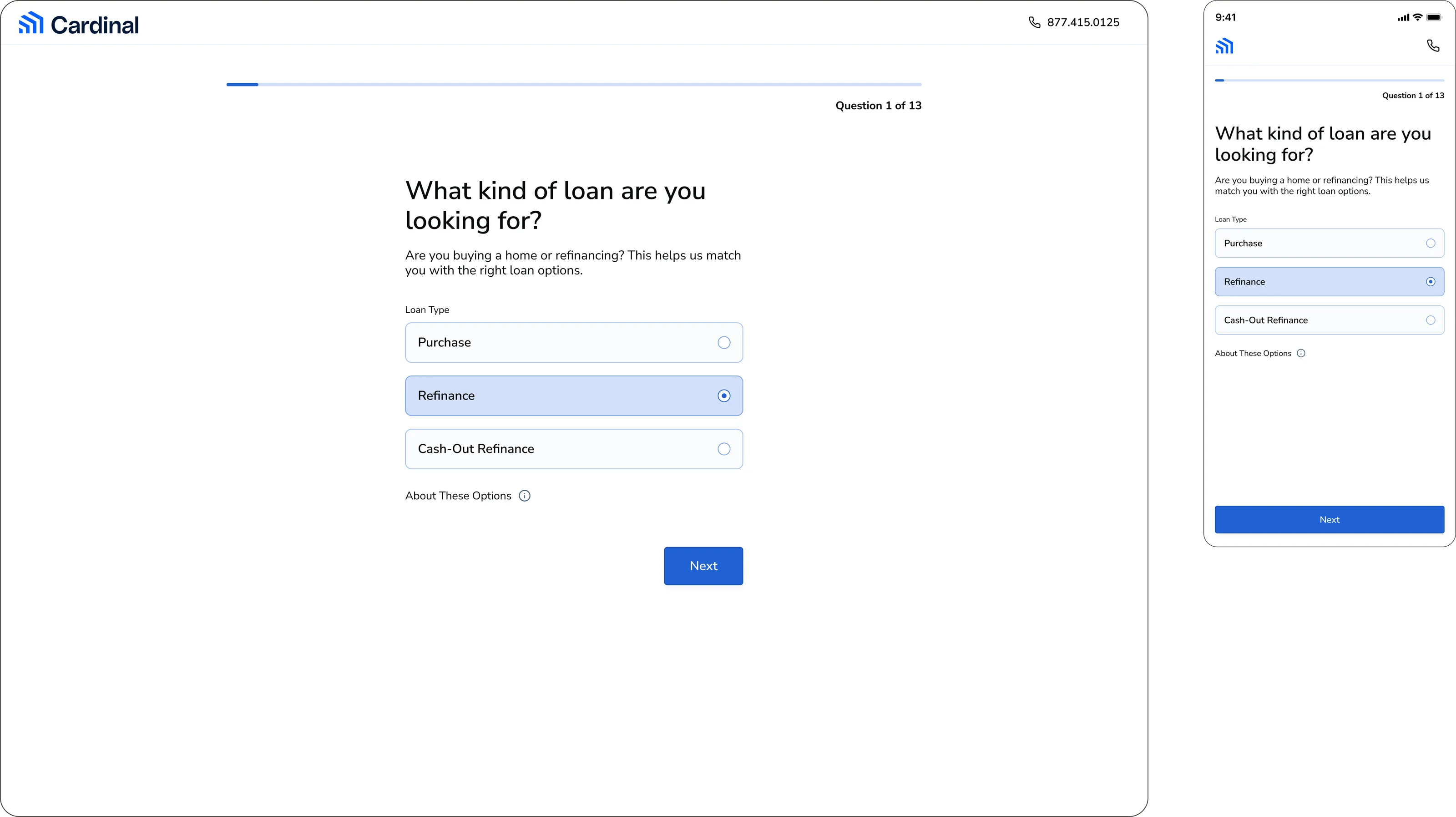
The rebuilt Public Loan Quote on desktop and mobile, showing question 1 of 13, 'What kind of loan are you looking for?', with Purchase, Refinance and Cash-Out Refinance options beneath a progress bar.
The rebuilt PLQ MVP simplified the quote experience across desktop and mobile, contributing to immediate gains in leads, engagement, and conversion.

Tracking toward an MVP launch in the coming quarter, the Borrower Dashboard was the first B2C product redesigned in its entirety with Cardinal’s AI-native Northstar design system (see case study here). The redesign project established patterns, components, and AI-assisted workflow protocols that will continue to scale across the broader Borrower Experience.
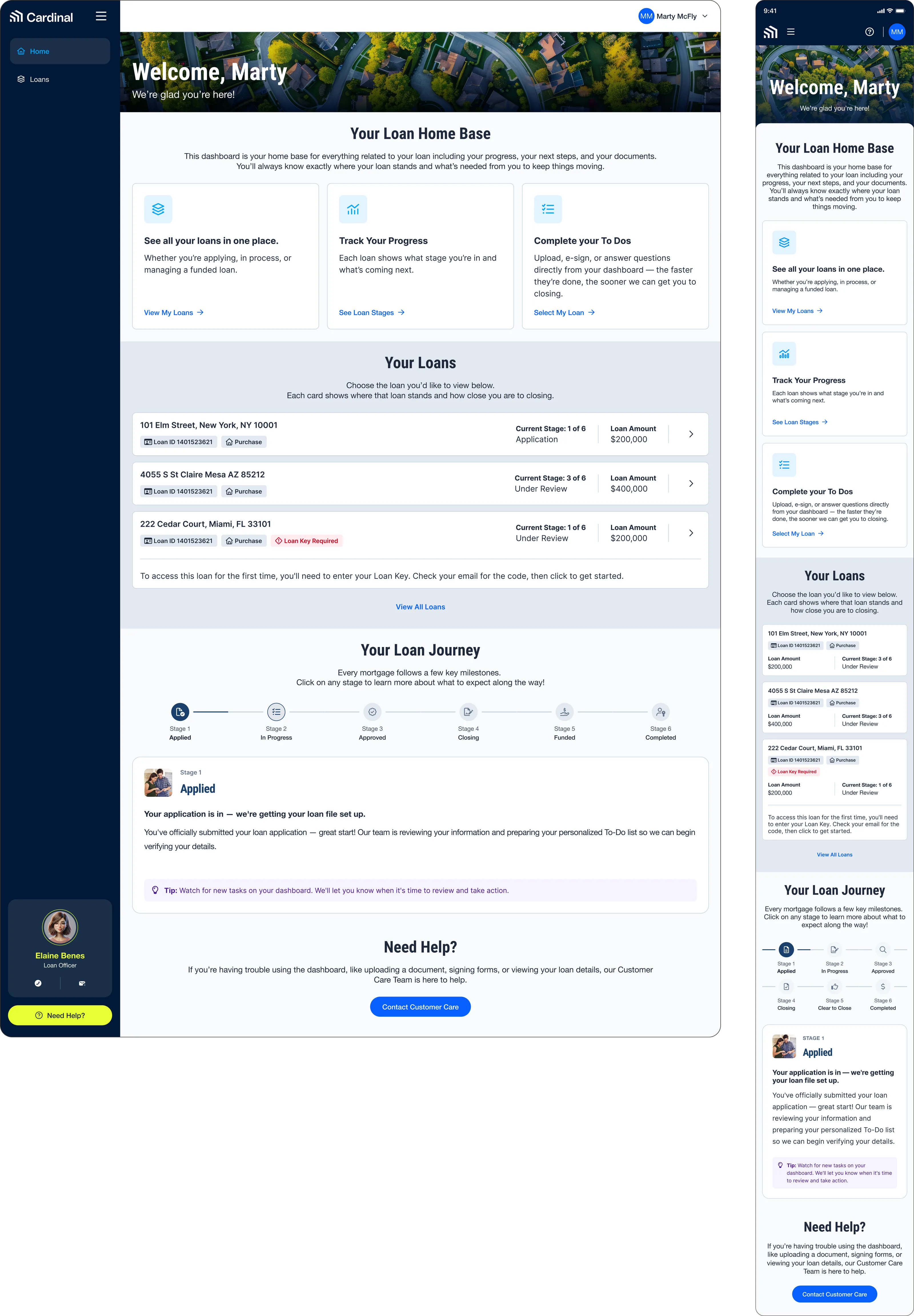
The redesigned Borrower Dashboard on desktop and mobile: a welcome banner over an aerial photograph of a neighborhood, three cards covering loans, progress and to-dos, a list of loans with their current stage and amount, and a six-stage loan journey tracker.
The redesigned Borrower Dashboard brings loan status, progress, next steps, and the broader loan journey into one responsive home base, giving borrowers greater clarity throughout the mortgage process.

Following the PLQ and Borrower Dashboard initiatives, Smart App has been building on this foundation by leveraging the patterns, components, and workflows established by the leading projects. As development continues, we expect the Smart App redesign to demonstrate how a more connected borrower ecosystem can accelerate product evolution while improving consistency, flexibility, and scalability across the entire Borrower Experience.
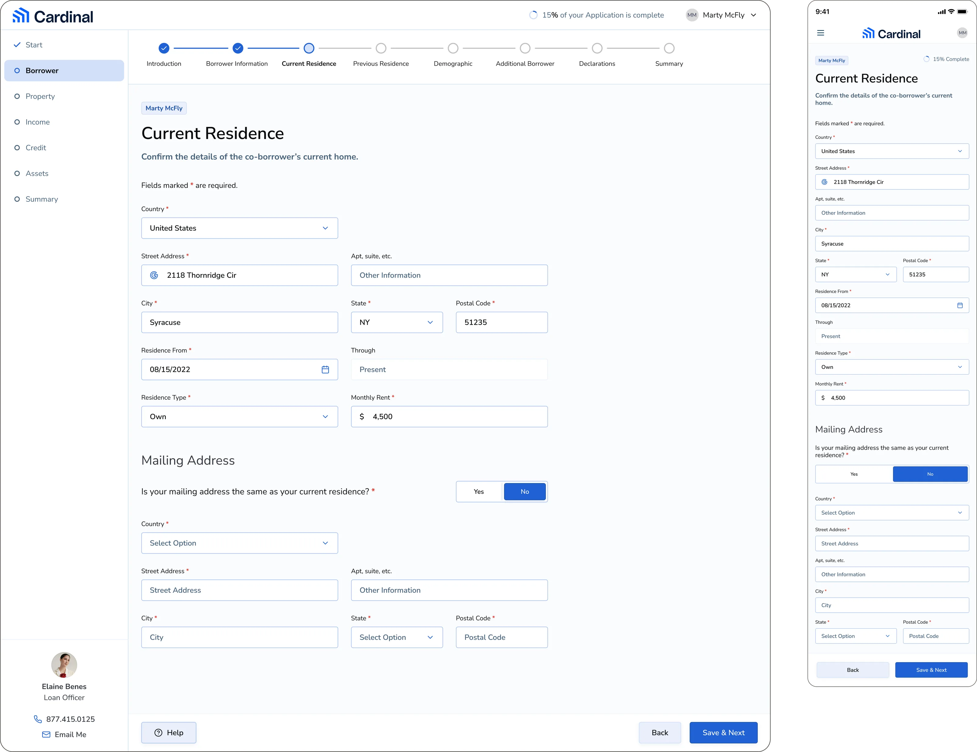
The Smart App application on desktop and mobile, showing the Current Residence step with a progress stepper across the top, a section list down the left, address and residence fields, and a loan officer's contact card.
Early Smart App design explorations extend the evolving Borrower Experience vision into a simpler, more intuitive mortgage application flow across desktop and mobile.

My Role

As Product Designer, I collaborated with product leadership, engineering, marketing, stakeholders, and fellow designers from discovery through implementation across the Borrower Experience ecosystem.

I served as the principal Product Designer for the PLQ rebuild, leading it from research through developer handoff, and am serving as a contributing Product Designer for both the Borrower Dashboard and Smart App redesign.

For PLQ, my responsibilities included:

  • Led end-to-end product design
  • Product strategy and feature definition
  • Requirements gathering and stakeholder alignment
  • Led UX research and discovery
  • Conducted experience audits and competitive analysis
  • Problem definition and opportunity identification
  • Information architecture and user flows
  • User flow and journey mapping
  • Wireframing and high-fidelity UI design
  • Interactive design and prototyping
  • Responsive experience design
  • Developer handoff
  • Internal testing and iterative refinement
  • Developer collaboration and design QA
  • Post-launch iteration planning
  • Analytics-driven product refinement roadmap

Across the Borrower Dashboard and Smart App, my responsibilities so far have included:

  • UX research and discovery
  • Experience audits and competitive analysis
  • Product strategy and collaborative workshops
  • Information architecture and user flows
  • Northstar Design System implementation
  • High-fidelity UI design
  • Interactive design and prototyping
  • Responsive experience design
  • Developer handoff
  • Internal testing and iterative refinement
  • Developer collaboration and design QA

As the Borrower Experience continues to evolve, I remain the product owner for PLQ while continuing to collaborate on the Borrower Dashboard and Smart App, helping shape a more connected borrower ecosystem through ongoing product improvements, Northstar adoption, analytics-driven iteration, and AI-assisted design workflows.

The Challenge

The Borrower Experience had evolved incrementally over several years, creating inconsistent user flows, duplicated interactions, and unnecessary complexity between products, which created an inconsistent borrower journey. PLQ functioned primarily as a siloed lead-generation form that did not lead to borrower acquisition, Smart App contained long, complex application flows with low completion rates, and the Borrower Dashboard lacked the clarity and scalability needed to support borrowers throughout their mortgage journey.

The challenge was to redesign each individual product while simultaneously creating a cohesive experience that could connect every stage of the borrower journey and support future growth.
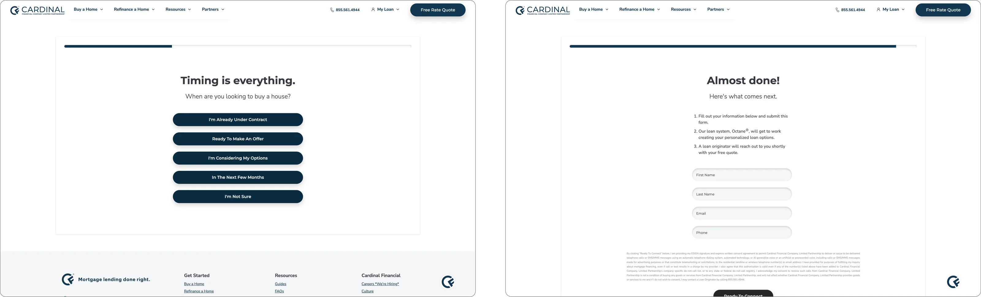
Two screens from the legacy Public Loan Quote: a 'Timing is everything' step asking when the borrower is looking to buy, offering five choices from already under contract through to not sure, and an 'Almost done!' step setting out what happens next, that the loan system Octane will build the loan options and a loan originator will reach out with the free quote, above fields for name, email and phone. Both sit on the Cardinal marketing site with its navigation and footer.
The legacy PLQ offered a short, standalone quote flow that ultimately captured a lead instead of delivering the expected rate quote, leaving borrowers without a clear or immediate next step.
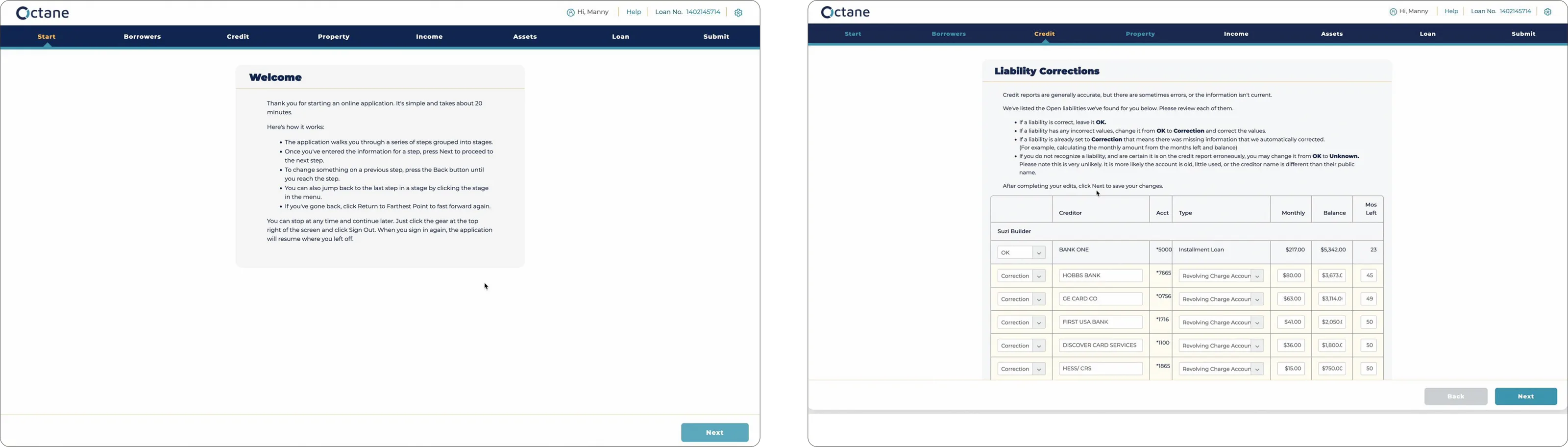
Two screens from the legacy Smart App, branded Octane: a Welcome page explaining that the application runs through a series of steps grouped into stages, and a Liability Corrections step with a dense table of creditors, account types, monthly amounts and balances to review one by one.
The legacy Smart App spread a complex mortgage application across long, dense workflows, creating friction throughout an already demanding process.
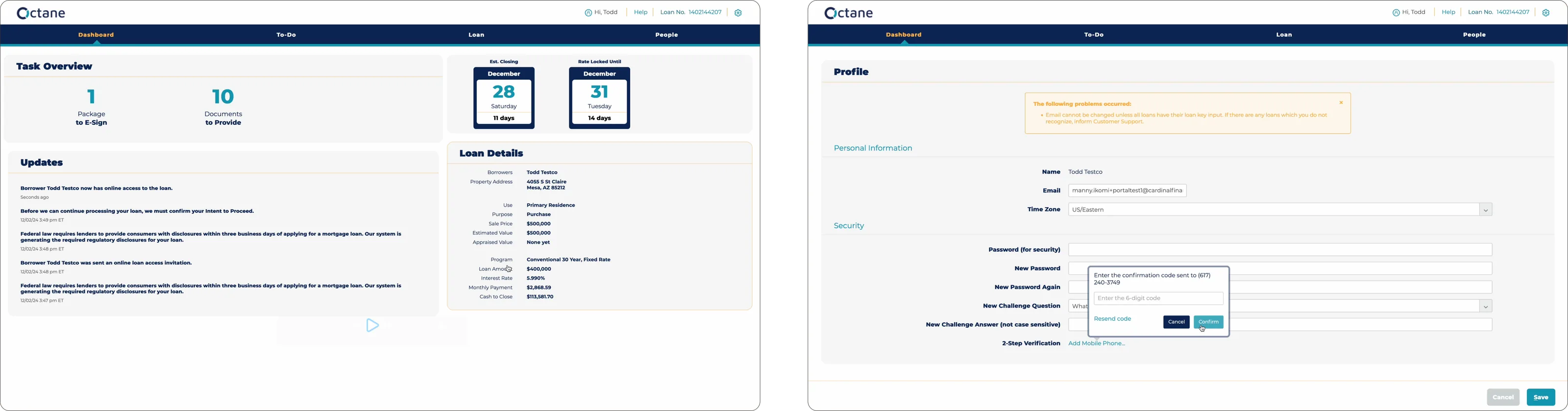
Two screens from the legacy Borrower Dashboard, branded Octane: a Task Overview of packages to e-sign and documents to provide beside closing dates and loan details, and a Profile page of password, challenge question and two-step verification fields under an error banner.
The legacy Borrower Dashboard surfaced loan details, tasks, and account information without a clear hierarchy or sense of progress through the mortgage journey.

Research & Discovery

When we kicked off the initiative in 2024, we conducted comprehensive and in-depth research and discovery on the existing borrower journey, across PLQ, the Borrower Dashboard, and Smart App. We evaluated the end-to-end borrower journey through experience audits, journey mapping, information architecture, user flows, competitive analysis, and cross-functional workshops to identify friction points, usability issues, and opportunities for a more connected product ecosystem.
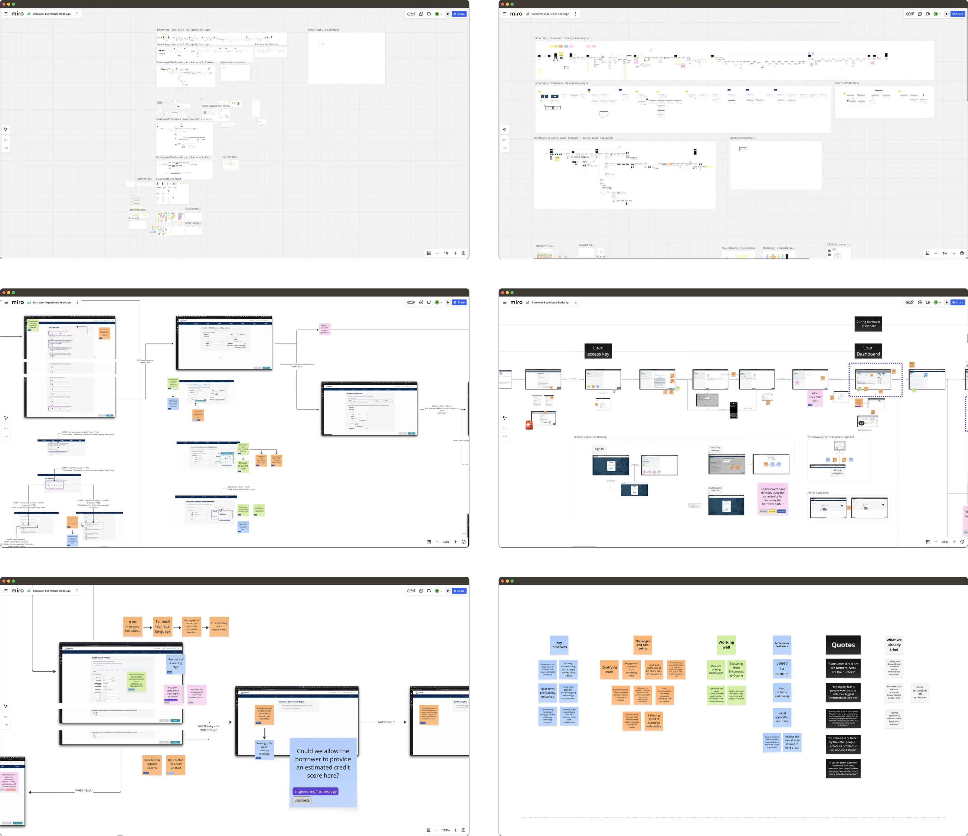
Six Miro boards from the Borrower Experience Redesign file: Smart App scenario flows traced end to end, Dashboard loan scenarios, screen-by-screen flows annotated with sticky notes and open questions, and a workshop board grouping key initiatives, challenges and pain points, what is working well, performance indicators, stakeholder quotes, and what had already been tried.
Auditing Smart App and the Borrower Dashboard exposed friction, complexity, and disconnected interactions across the existing borrower journey.
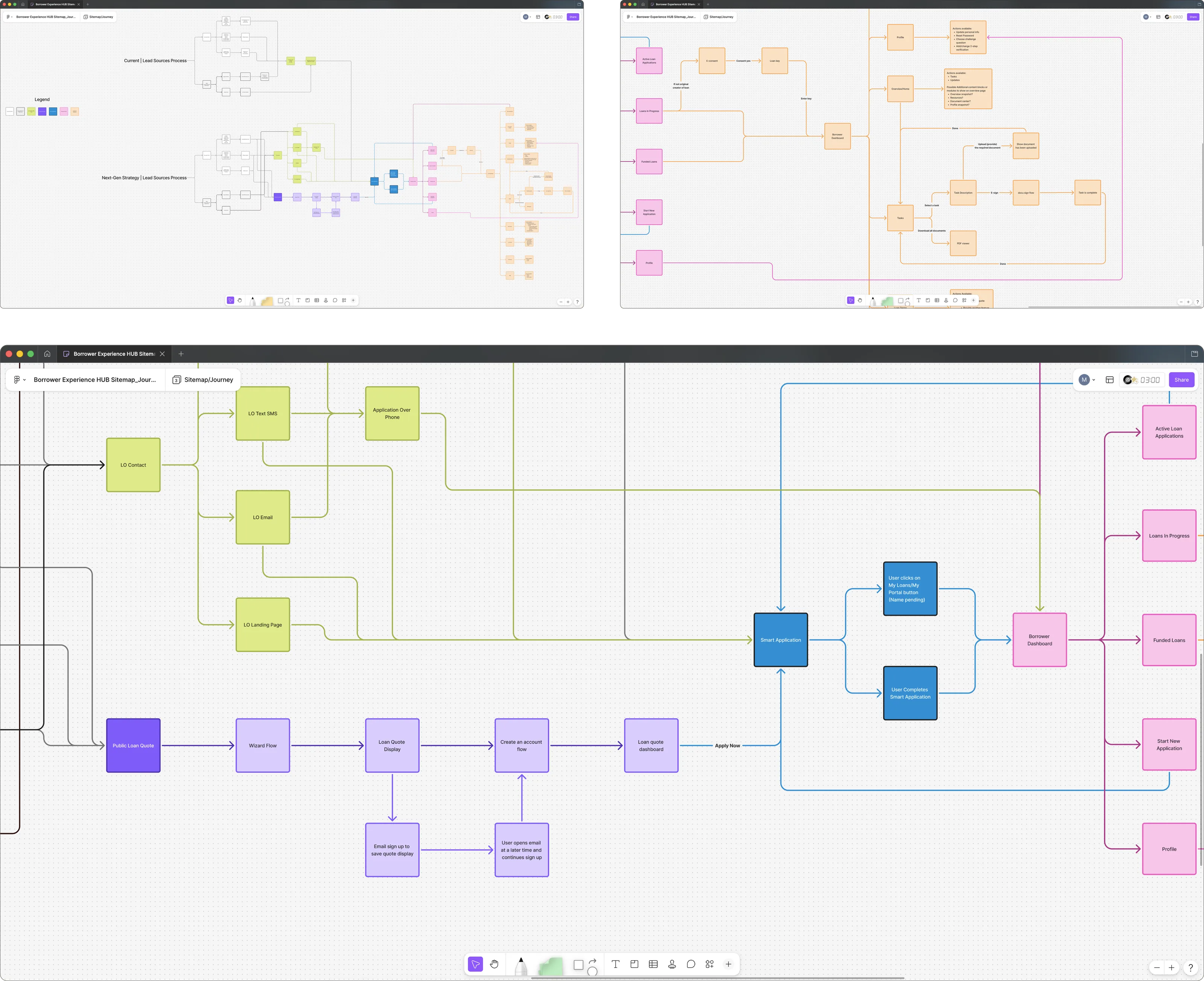
A Borrower Experience HUB sitemap and journey diagram, with a zoomed detail showing loan officer contact routes and the Public Loan Quote wizard both feeding into the Smart Application, which leads on to the Borrower Dashboard and from there to active loan applications, loans in progress, funded loans, and profile.
Mapping the broader ecosystem revealed opportunities to connect PLQ, Smart App, and the Borrower Dashboard into a more continuous end-to-end borrower journey.

In particular, I led the research and discovery for PLQ as the principal Product Designer. Because PLQ serves as borrowers’ first interaction with the digital mortgage experience, I focused on understanding how information architecture, user journeys, and progressive disclosure could simplify an inherently complex decision-making process. The research centered on extensive journey mapping to identify friction and drop-off points during borrower acquisition, in-depth audits of the existing information architecture, usability issues, and UI layouts to identify areas for improvement, and broad competitive analysis and cross-functional workshops to examine how best to present complex mortgage information in a digestible way, build trust through transparency, and create a clear path from anonymous visitor to qualified lead. The insights gained from this research and discovery directly informed the product strategy, feature prioritization, interaction model, and end-to-end user flows that shaped the redesigned PLQ experience.
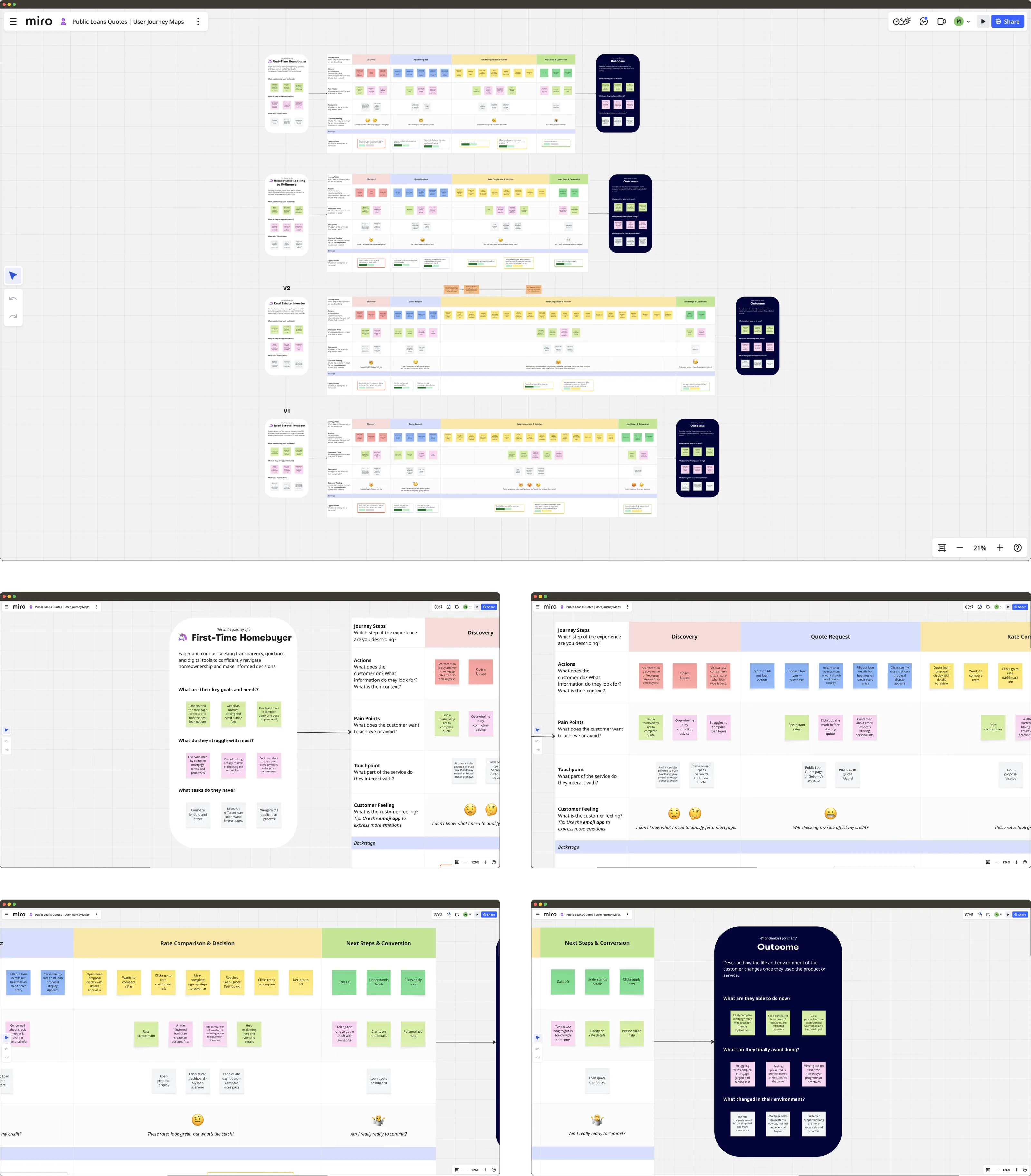
Miro journey maps for three borrower personas, a first-time homebuyer, a homeowner looking to refinance, and a real estate investor, each running across discovery, quote request, rate comparison and decision, and next steps and conversion, with rows for actions, pain points, touchpoints, and customer feeling marked by emoji, closing on an outcome panel.
Mapping the PLQ journey across borrower types surfaced key friction, uncertainty, and drop-off points from initial discovery through conversion.
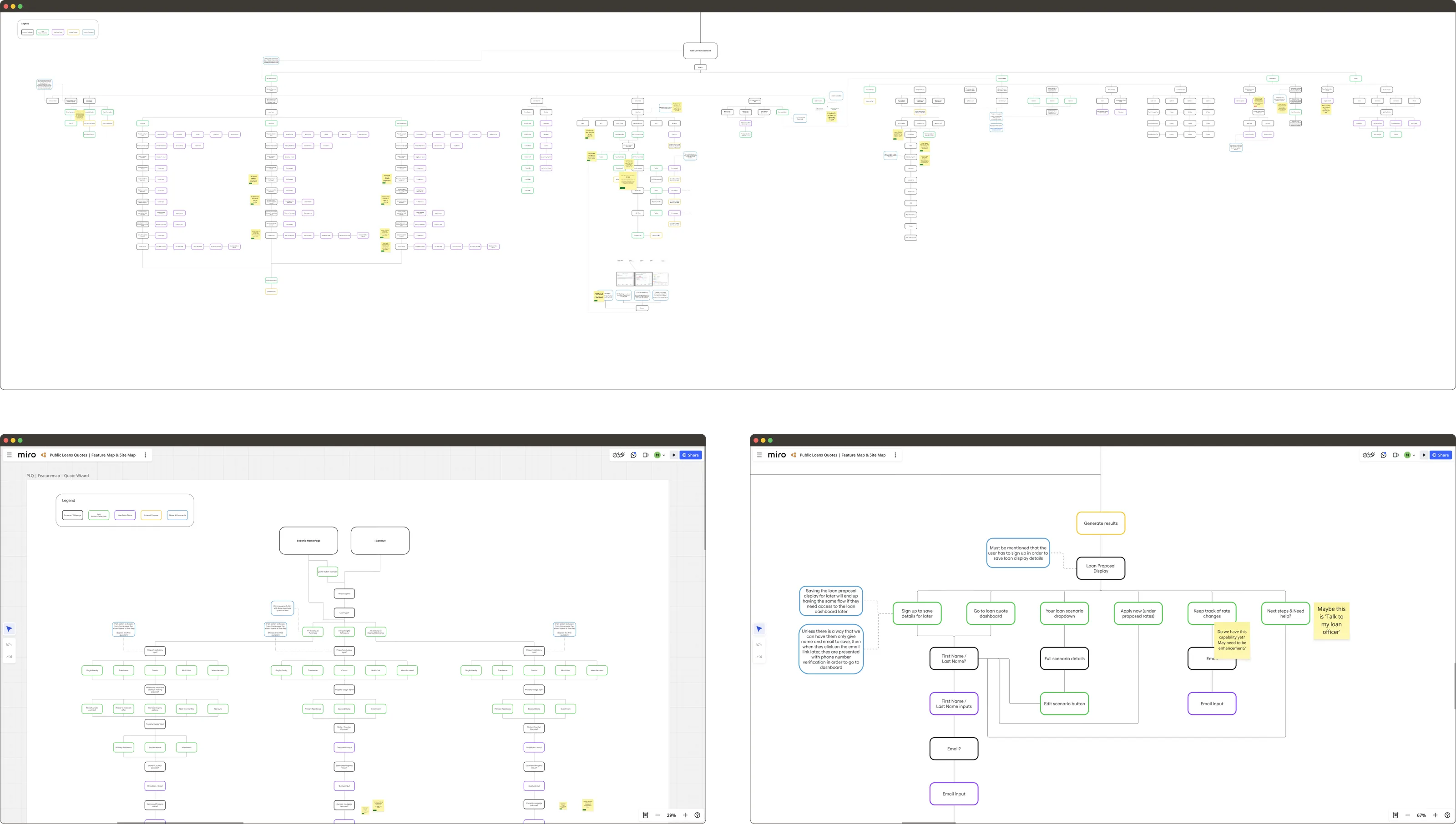
The Public Loan Quote feature map and site map, a large branching diagram of every screen and state, with a zoomed detail of the quote wizard covering the loan proposal display, saving a scenario, sign-up and email capture, and the route through to the loan quote dashboard.
Auditing PLQ screen by screen exposed unnecessary complexity and informed a clearer information architecture, user flow, and progression through the quote experience.
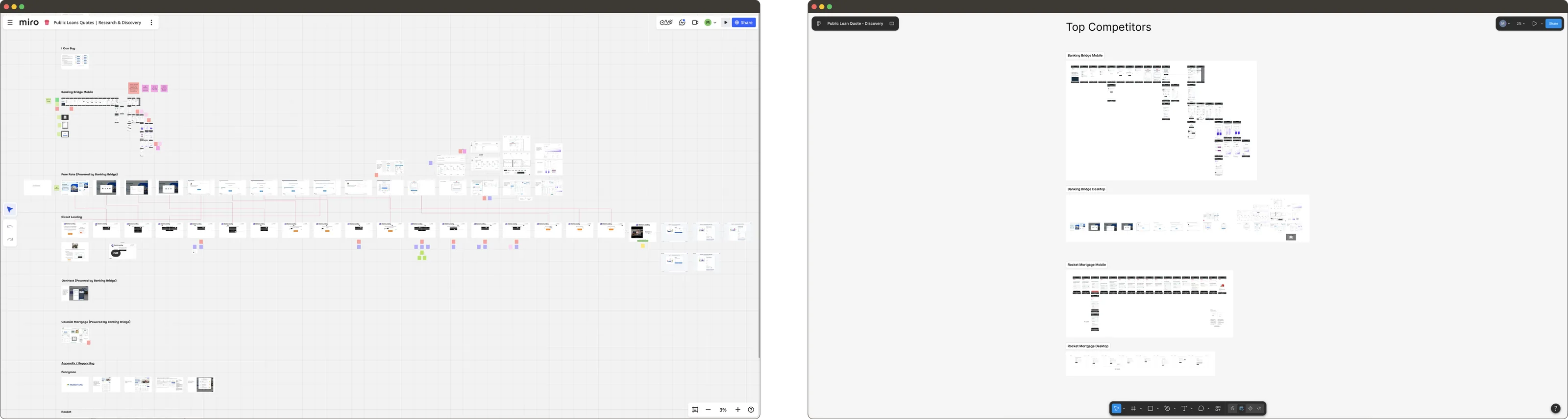
Two competitor analysis boards. On the left, a Miro board capturing several lenders' full rate-quote flows screen by screen; on the right, a Top Competitors board comparing Banking Bridge and Rocket Mortgage on both mobile and desktop.
Comparing leading mortgage quote experiences revealed how competitors structured complex decisions, disclosed information, and guided borrowers toward their next step.
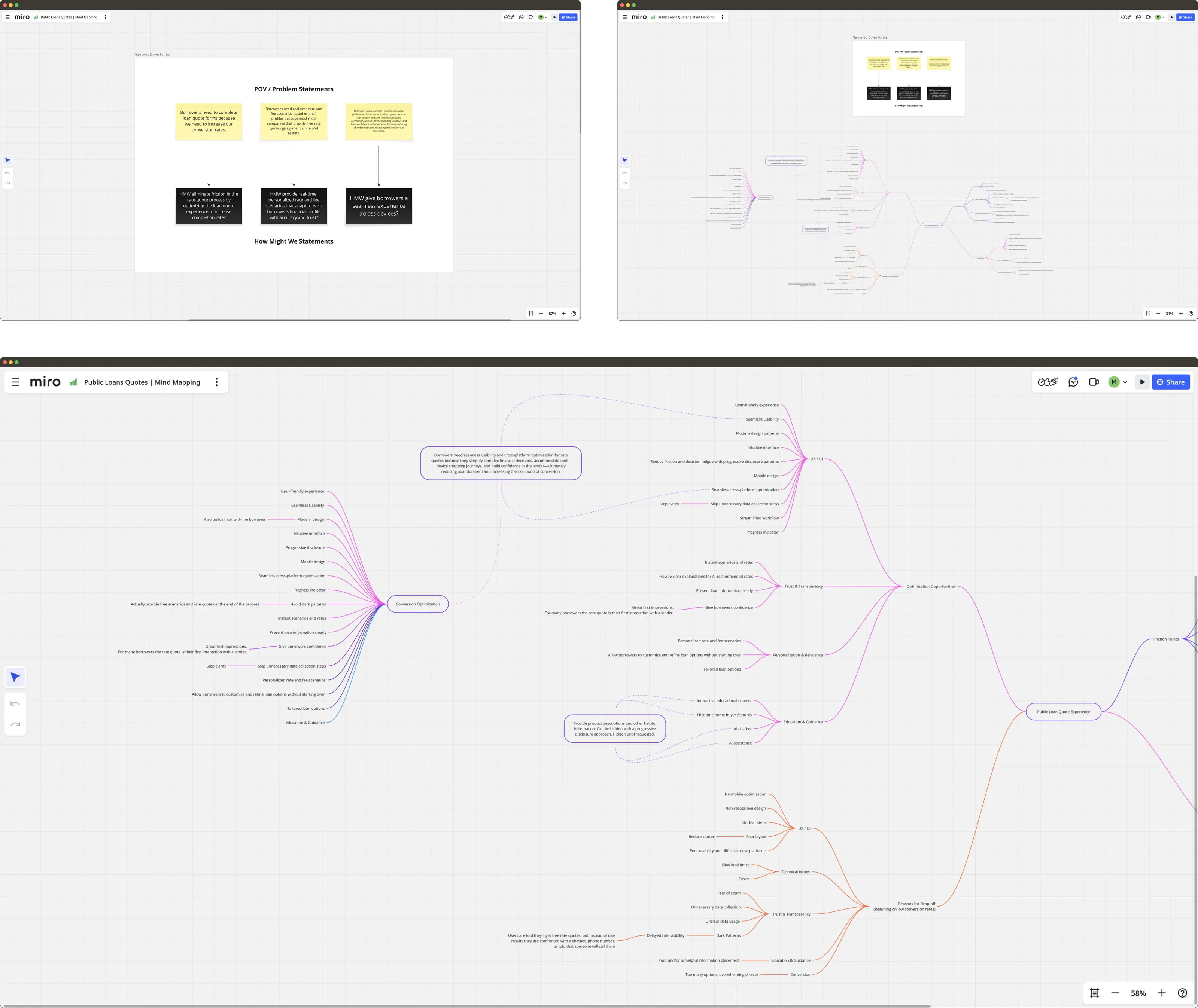
A POV and problem statements board pairing three borrower problem statements with matching How Might We questions, beside a large mind map branching the Public Loan Quote experience into optimization opportunities across UX and UI, trust and transparency, personalization and relevance, and education and guidance, and separately into reasons for drop-off.
Synthesizing the research transformed recurring pain points into opportunity areas and How Might We questions that informed product strategy and feature prioritization.

Solution & Design

Each individual redesign and rebuild project was informed by the overarching goal of creating unified key workflows across the products while improving usability, consistency, and scalability.

The PLQ rebuild introduced improved navigation, clearer application flows, cohesive interface patterns, responsive layouts, and modern authentication pathways that reduced friction throughout the borrower’s journey from casual interest and information seeking to engagement, onboarding, and retention. As the first prong of the multi-pronged Borrower Experience project to reach completion, the PLQ rebuild also defined the framework and core design principles to guide the overall reimagination of the Borrower Experience as a unified and cohesive ecosystem.
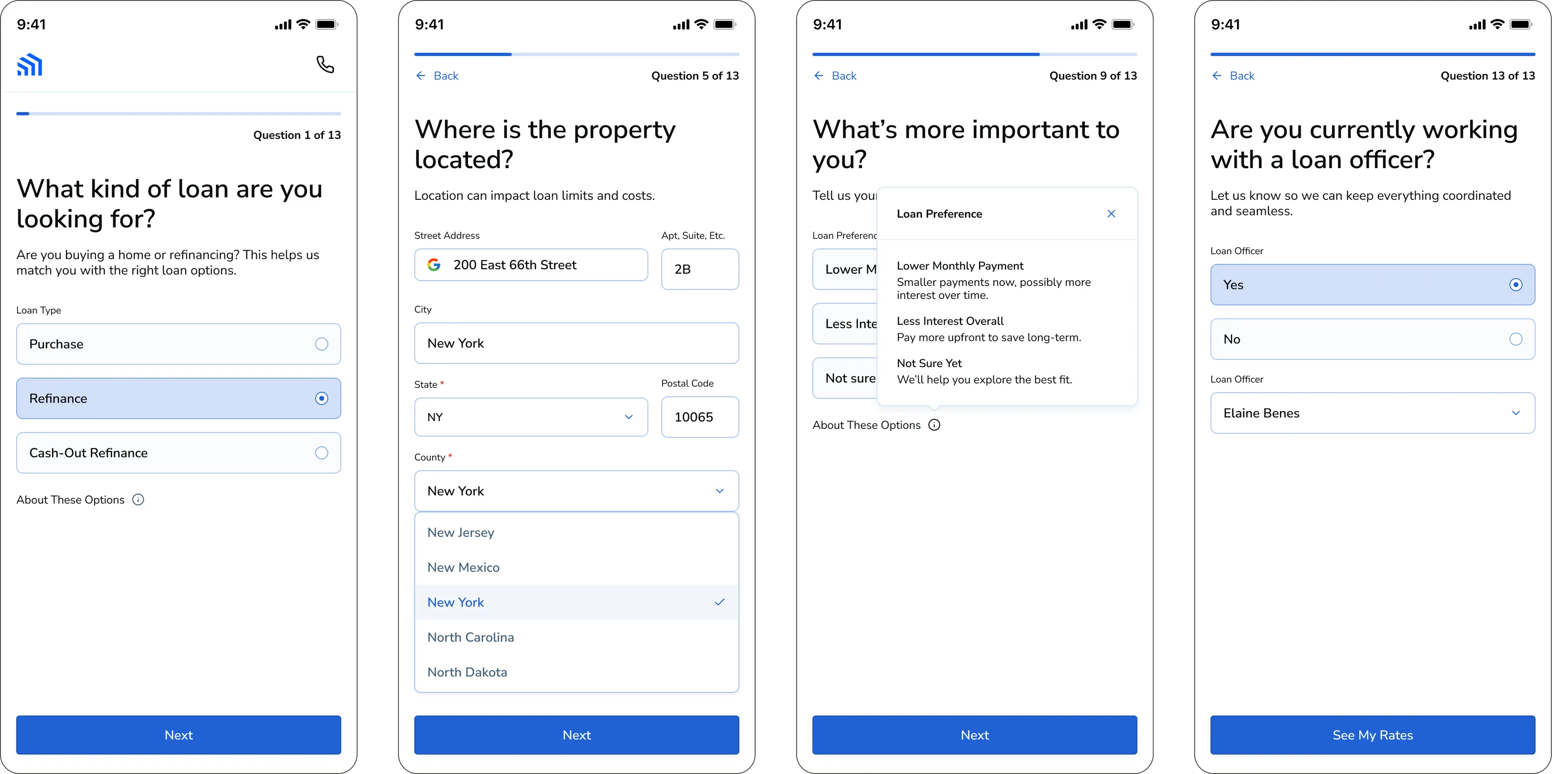
Four steps of the rebuilt Public Loan Quote wizard on mobile: 'What kind of loan are you looking for?', 'Where is the property located?', 'What's most important to you?' with a loan preference panel open, and 'Are you currently working with a loan officer?', each showing its position out of thirteen questions.
A progressive quote wizard breaks complex qualification into focused decisions, with clear context and visible progress throughout the experience.
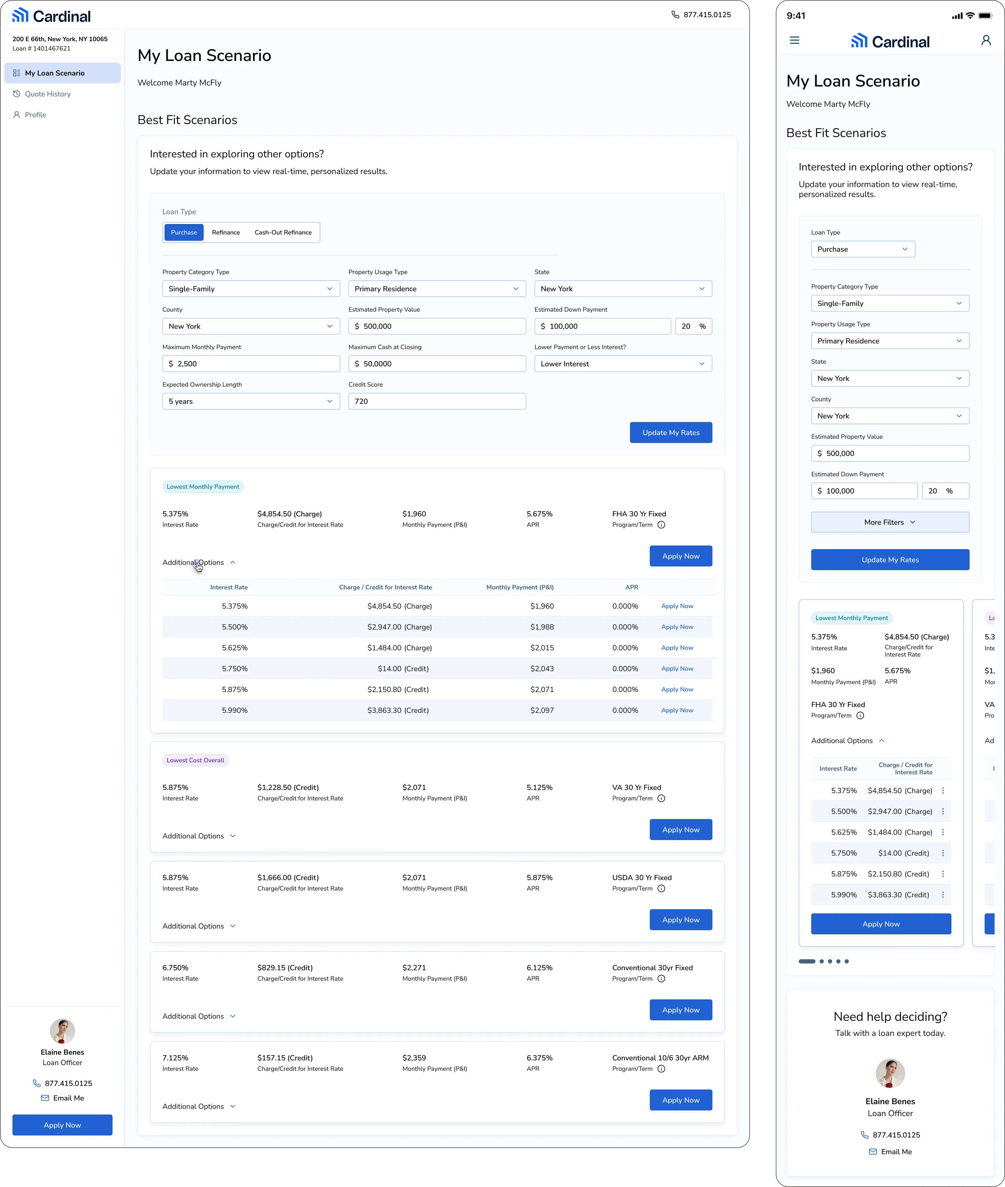
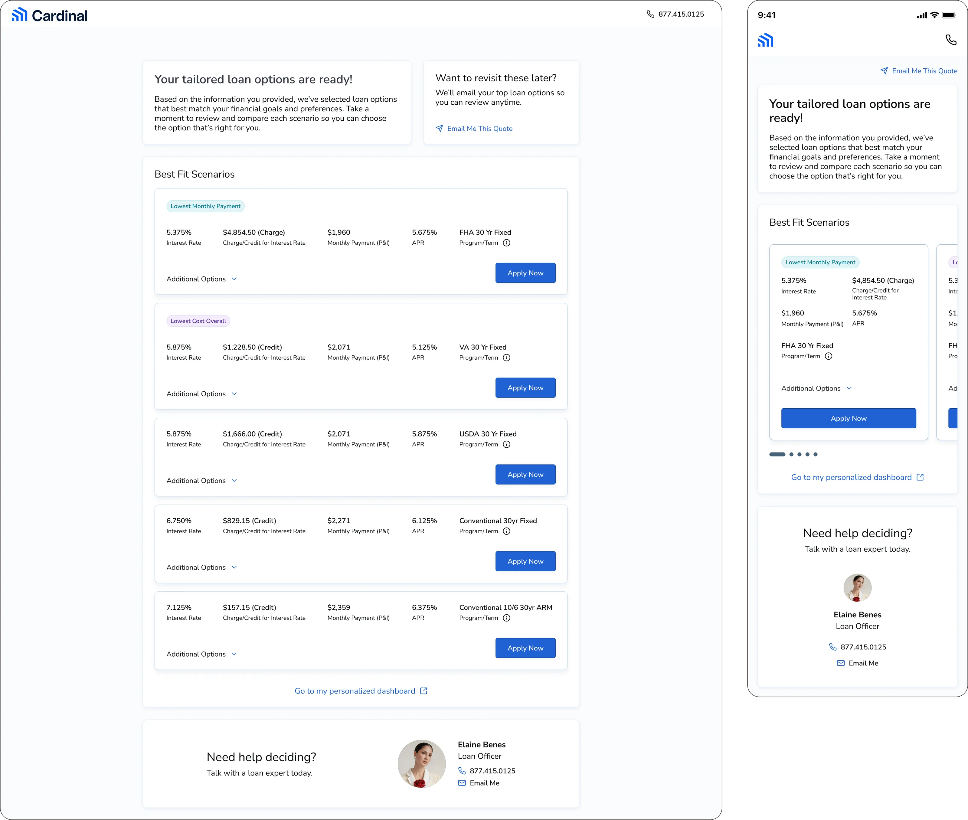
The PLQ results page on desktop and mobile, headed 'Your tailored loan options are ready!', listing best-fit scenarios tagged Lowest Monthly Payment and Lowest Cost Overall with interest rate, charge or credit, monthly payment, APR and program term, each row carrying an Apply Now button, beside an option to be emailed the quote and a card offering to talk to a loan officer.
Personalized loan scenarios present rates, costs, and terms consistently, making options easier to understand and compare while creating a direct path into application.
The signed-in My Loan Scenario dashboard on desktop and mobile, showing an editable panel of loan type, property, county, value, down payment, monthly payment and credit score inputs above the best-fit scenario list, with the Lowest Monthly Payment card opened into a full table of interest rates against charge or credit, monthly payment and APR.
A persistent scenario dashboard lets borrowers revisit and refine their information, compare updated options, and explore additional rate details without starting over.

The Borrower Dashboard redesign simplified user journeys, improved visual hierarchy, and added cohesiveness with PLQ. Redesigned in its entirety with Cardinal’s AI-native Northstar design system (see case study here), the project created replicable patterns, added new components, and established AI-assisted workflow protocols for the broader Borrower Experience as the PLQ and Borrower Dashboard projects move beyond MVP and Smart App redesign continues.
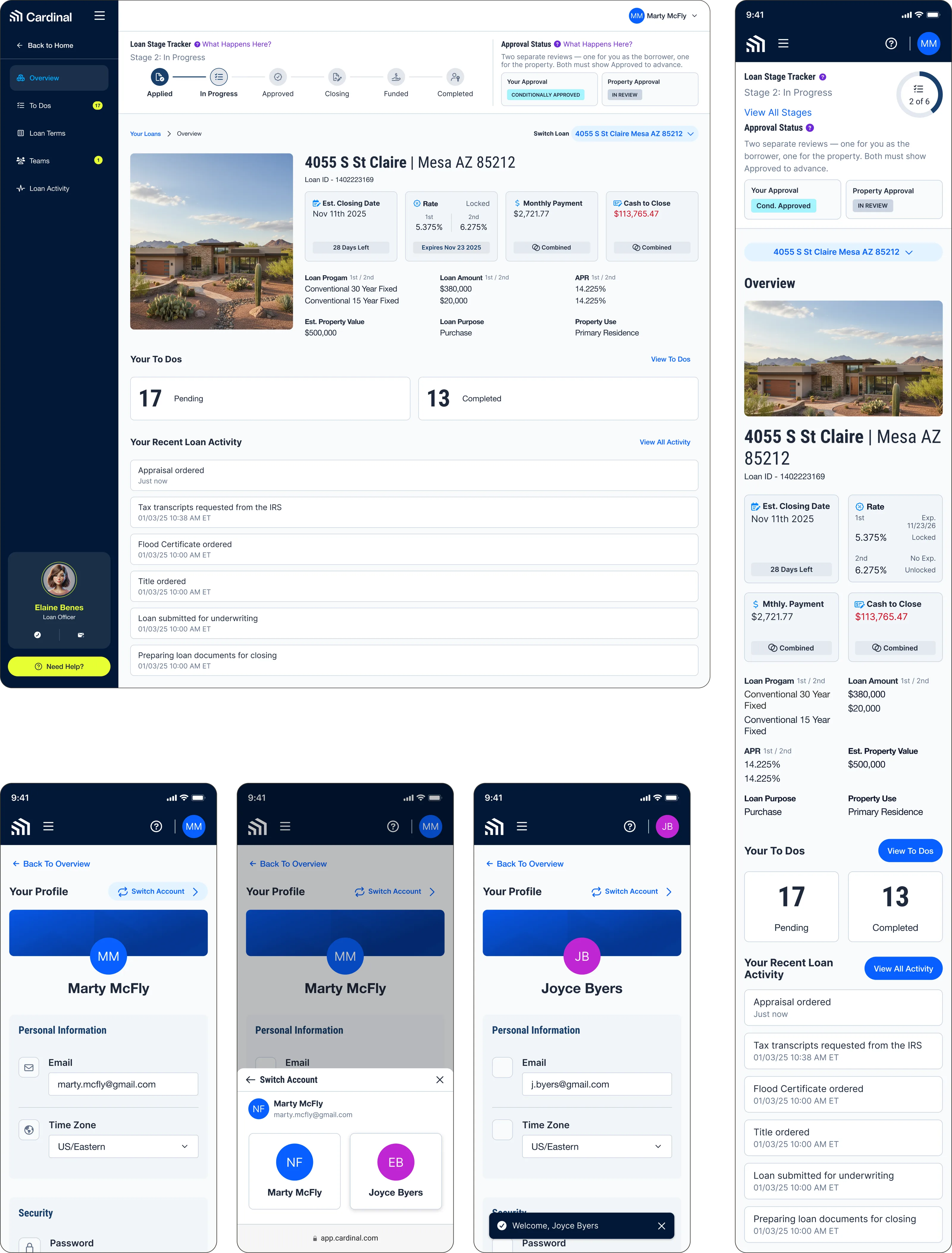
The redesigned Borrower Dashboard overview on desktop and mobile: a six-stage loan tracker from Applied to Completed, separate borrower and property approval statuses, a property card carrying estimated closing date, locked rate, monthly payment and cash to close, counts of pending and completed to-dos, and a recent loan activity feed, followed by mobile screens for switching between borrower accounts.
The redesigned dashboard brings loan stage, approval status, costs, tasks, and recent activity into a clear overview of where borrowers stand and what comes next.
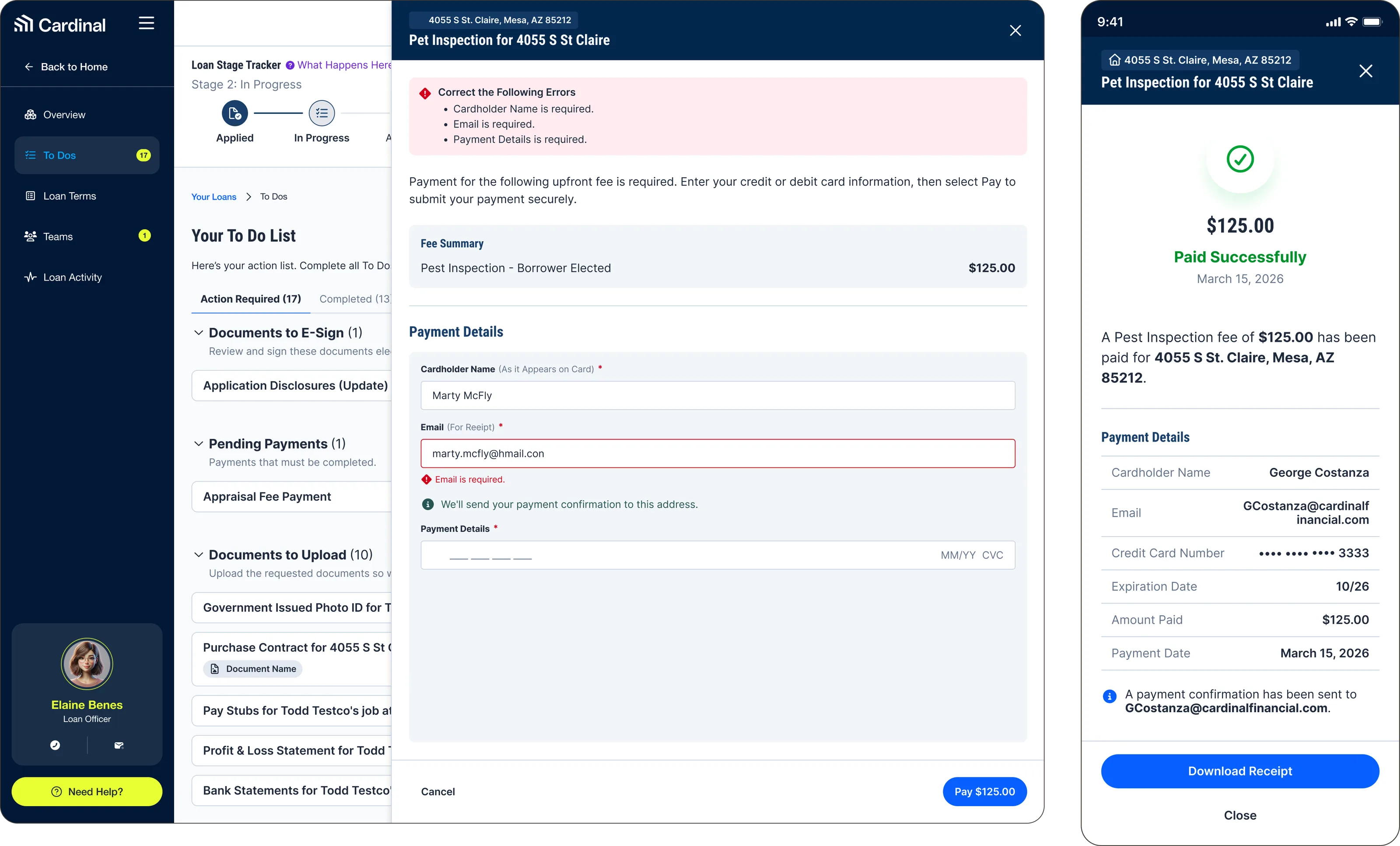
The dashboard To Do list on desktop, grouping documents to e-sign, pending payments and documents to upload, with a pest inspection fee payment open over it showing validation errors on card name, email and payment details, and the mobile confirmation screen reporting the fee paid successfully with a downloadable receipt.
Integrated tasks bring actions such as document uploads, signing, and payments directly into the dashboard, reducing reliance on disconnected channels and workflows.
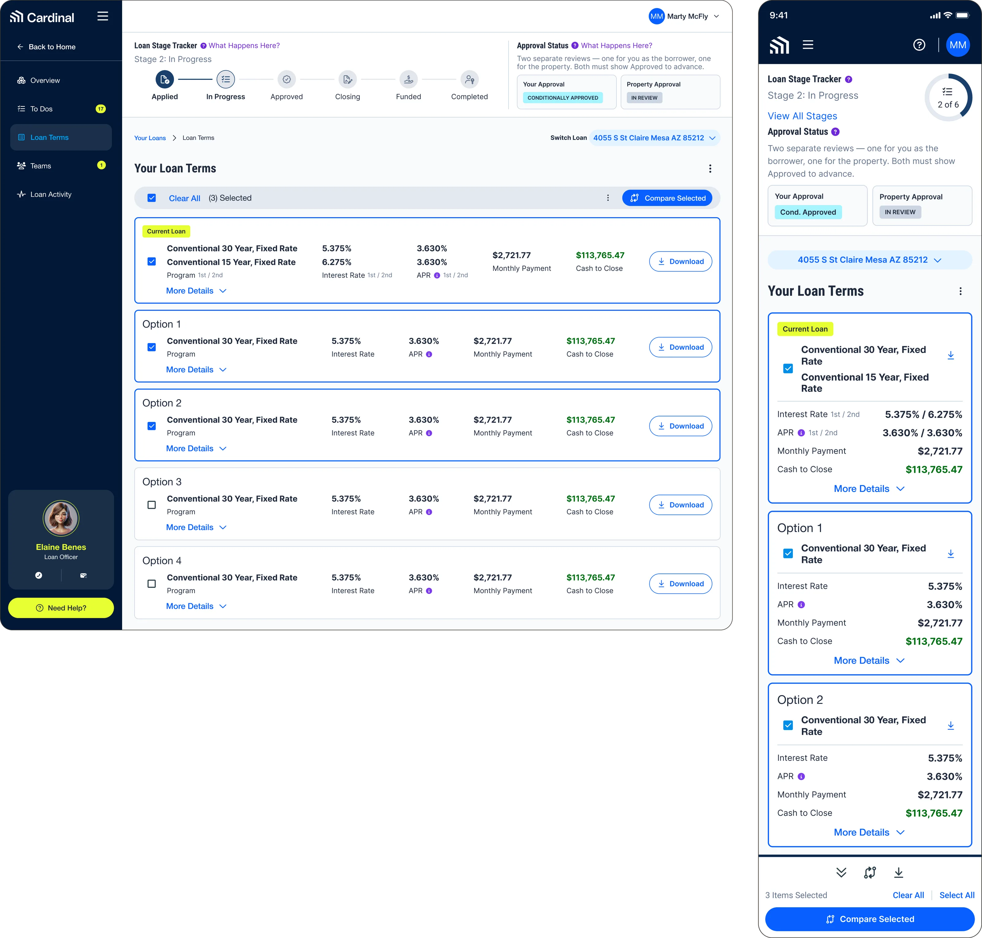
The dashboard Loan Terms page on desktop and mobile, listing the current loan and four alternative fixed-rate options with interest rate, APR, monthly payment and cash to close, each carrying a selection checkbox, a More Details expander and a Download button, with a Compare Selected action above them. The six-stage loan tracker and the borrower and property approval statuses run across the top.
A consistent comparison model puts loan terms side by side, helping borrowers evaluate options across the same key measures before making a decision.
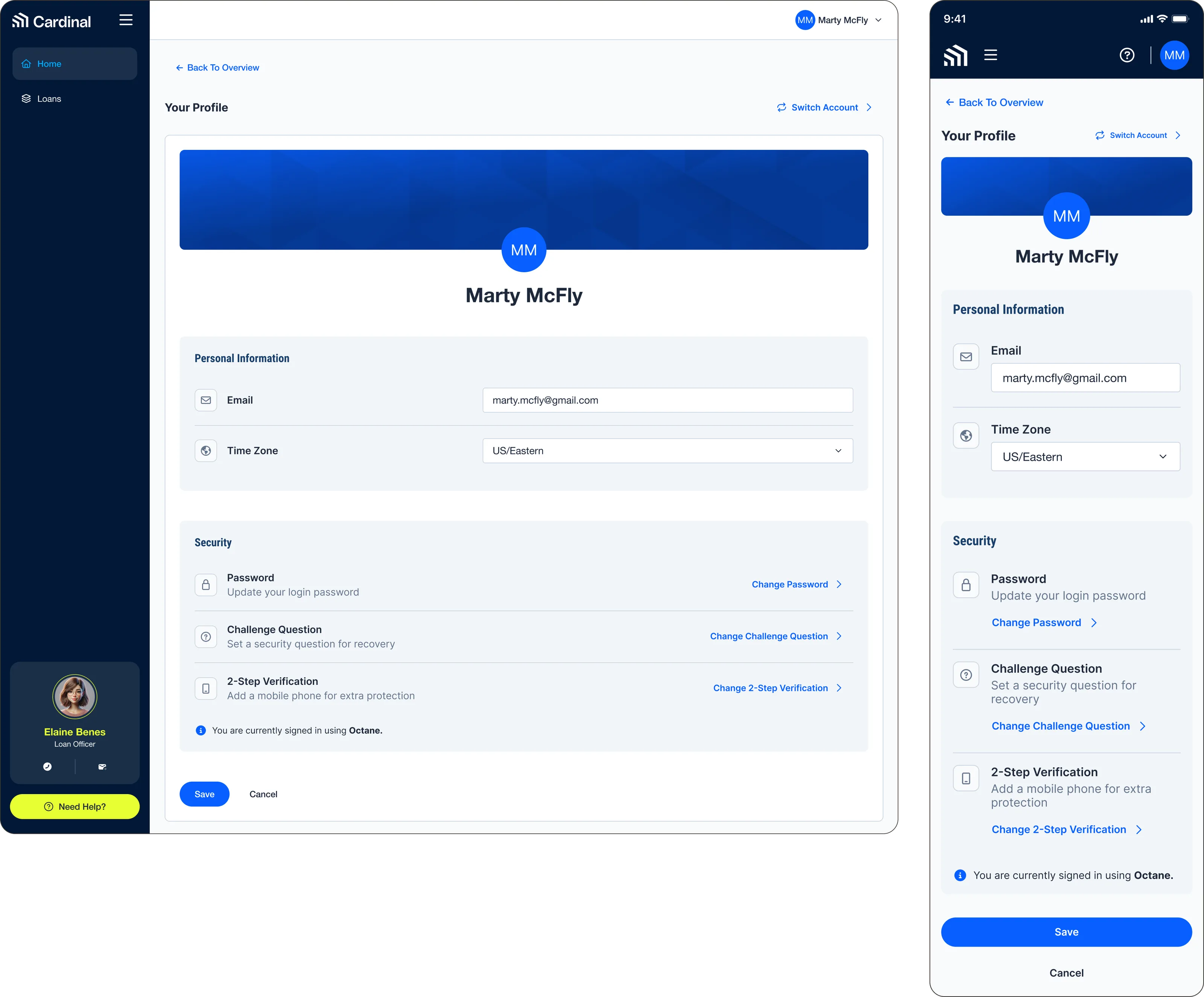
The dashboard profile page on desktop and mobile, showing personal information for email and time zone above a security section covering password, challenge question and two-step verification, with a note that the borrower is currently signed in using Octane.
Centralized profile and security settings establish a consistent account experience while creating a foundation for the broader unified authentication strategy.

Reflection

Ultimately, this project reinforced the power of effective product design. Elegant interfaces, intuitive interactions, logical product flows, and cohesive ecosystems drive user engagement and create measurable impact. More importantly, it reinforced that meaningful product transformation is built through sustained collaboration. The Borrower Experience transformation project continues to be a long-term, multi-pronged, company-wide initiative that brings together product, engineering, and marketing teams to continuously collaborate across multiple products. The PLQ MVP has launched, but the project is far from complete. As the Borrower Dashboard and Smart App continue to progress in their redesign projects, PLQ is fully expected to evolve and iterate with them, informing and being informed by the broader Borrower Experience as it transforms.
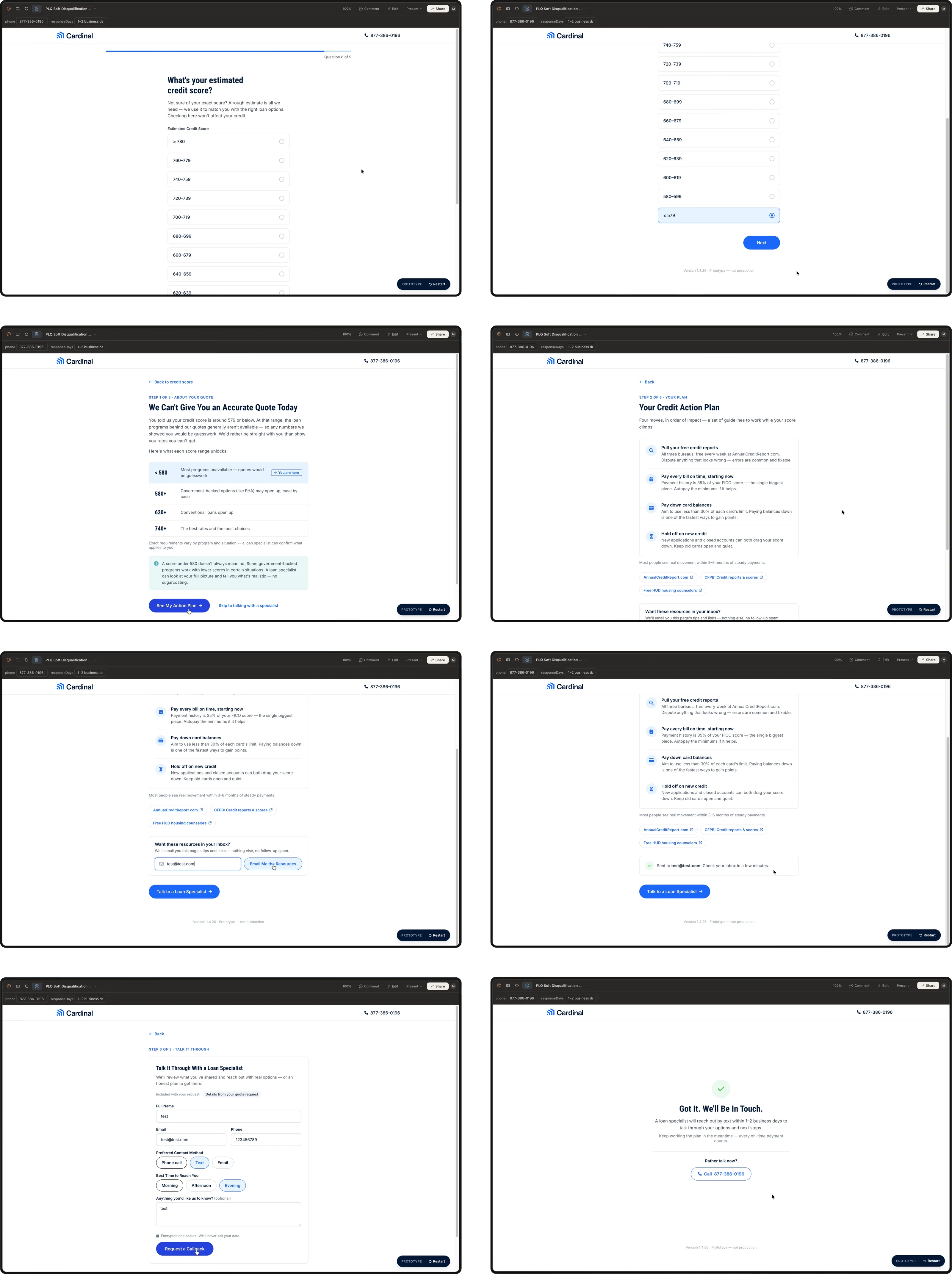
Eight frames of a Public Loan Quote soft-disqualification prototype built in Claude Design: the final credit score question with a score under 579 selected, a screen explaining that an accurate quote is not possible yet with a table of what each score range unlocks, a credit action plan of four prioritized moves with links to free credit resources, an option to have those resources emailed, a callback request form for a loan specialist, and a confirmation that someone will be in touch.
Iteration continues beyond the MVP. Ahead of rebuilding PLQ on Northstar, I’m incorporating Claude Design into my exploration and iteration process, using AI-driven rapid prototyping to test better wizard flows as part of Cardinal’s wider shift toward AI. Here, a hard stop for borrowers who may not qualify becomes a transparent credit action plan and a clear route forward.

Next project